What is display: contents?
This new value for the display property allows you to remove an element from the box tree but still keep its contents.
display: contents make sure the div doesn’t generate any box, so its background, border, and padding are not rendered. However, the inherited properties like color and font have an effect on the child (span) element as expected.
Check out the example below to understand how it works:
<div style="border: 1px solid red;
padding: 20px;color: white; font: 15px; Monospace; background: red;">
<span style="background: black;">foobar</span>
</div>
Output of this code will be :

display: contents make sure the div doesn’t generate any box, so its background, border, and padding are not rendered. However, the inherited properties like color and font have an effect on the child (span element) as expected.
Now we add display:contents to the above example :
<div style="display: contents; border: 1px solid red;
padding: 20px;color: white; font: 15px; Monospace; background: red;">
<span style="background: black;">foobar</span>
</div>
The final result would be:
<span style="background: black; color: white;
font: 15px;">foobar</span>
Output of this code will be:

Explaining display:contents property to order elements in mobile in different order as compared to desktop.
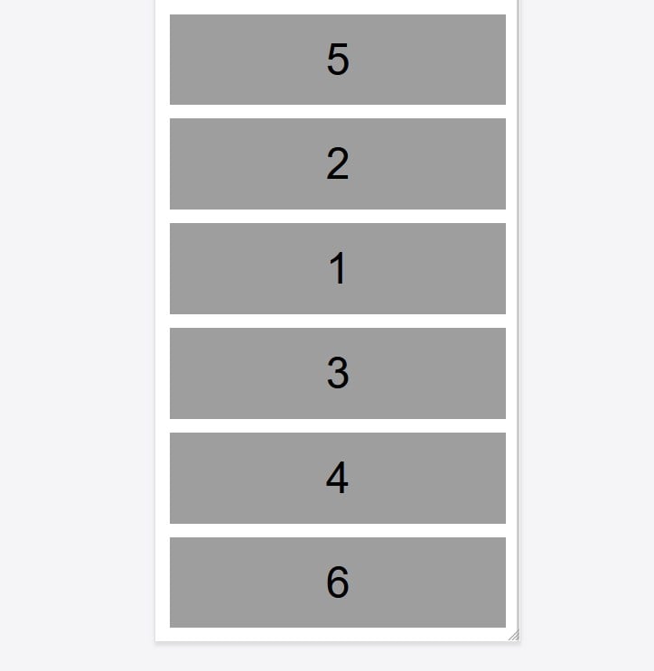
Let us take an example as shown in the screenshot above. It is desktop view. We need ordering of these blocks differently on mobile as shown below in the screenshot.


Here on desktop we have 2 columns that are combined into groups as shown in the screenshot below

Changes we have to do in mobile to change the order of blocks.
1) Group that has row1 and row2 combined in it should be given following css in mobile
display: flex;
flex-direction: column;
2) Row1 and Row2 should be given the following css in mobile. Display: contents causes an element's children to appear as if they were direct children of the element's parent, ignoring the element itself. So when display:contents property is used, row 1 and row 2 will be ignored and all columns will be treated as direct children of group.
display: contents;
3) Now we can give whatever ordering we want to give to columns. As per output required the ordering will be like this -
1
order: 3;
2
order: 2;
3
order: 4;
4
order: 5;
5
order: 1;
6
order: 6;


